Friday 26 February 2016
Monday 22 February 2016
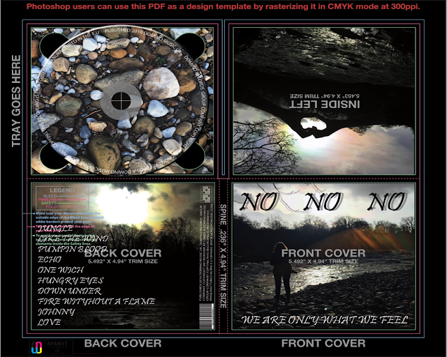
First Draft OF Digipak (with text)
Tuesday 16 February 2016
Wednesday 10 February 2016
Tuesday 9 February 2016
First Draft Of Digipak (without text)
This is the first of my final mock up I have used the same out door style in all of my images along with similar edits and filters. by doing this it has allowed me to achieve a similar look and style across all of the images. this is effective because this is helping the product to flow together well. I have not decided on the text, font, colour or positioning however I will be using the same style throughout the other platforms of promotion that I will be creating. on my magazine advert I will use the same text and similar style as my digipak.
Monday 8 February 2016
Mock Up Of Digipak
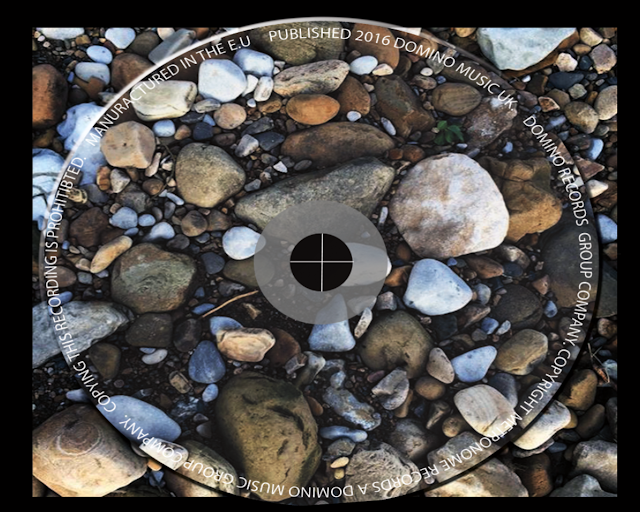
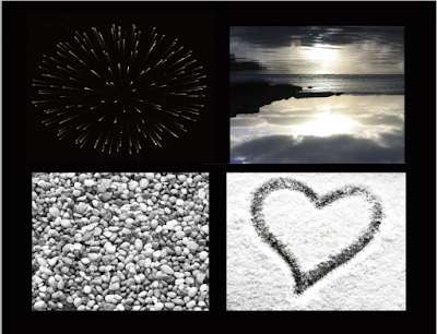
I have chosen o use images form online this has allowed me to find lots of different images that have different styles. this enabled me to find a style of photo that I like. I think that by including images that relate to the video this is important because this allows the video and other designs to flow together well. I have included a shot of the grid that shows where the cover and other parts feature. I think that by using a circular image on the CD cover this will allow me to print the design on the CD which will allow me to give the design a more 3D effect which will create a bolder aspect that stands out on the design.
Saturday 6 February 2016
Conventions - Disclosure Caracal

This is a vinyl cover for Disclosures album they have used a clear cover for their design allowing them to print text over the design without it being on the product this is effective as it allows the final product to not have text oni it and this enables it to be effective to use as art work.
they have used a single fold which allows them to have a four sided product. they have used an image that goes across the whole center panel this is a wide angled shot allowing the buyer t see what the image actually is . they have also included the long titles and information about them this includes the people who have helped compose them and the artists that have featured in them. this is good because it allows the viewer to see who was involved and how the songs were composed and made.
i think that by using a plastic sleeve on the product this is effective because it is allowing there to be added detail that will not effect the design and will not overload the design with unnecessary text. i think that by doing this it allows the product to be more unique and allows them to stand out from other designs that are similar to it. the used of mainly black color has allowed the product to be more distinctive and effective the design to have a bolder impact on the viewer.
Conventions - Oasis Acoustic
this is a two fold digipak this is effective because it allows the design to involve more features. they have includes an image of the bands logo on the cover by doing this it allows there to be a distinctive style on the products that they have they have included a shot of an acoustic guitar this links to the name of the album. by not including an image of any of the band members this is effective because this shows they are such a distinctive band that they do not need to be on the cover.
they have included many of the main conventions of a digipak they have the main title and other key features. they have used a brown color theme throughout this has been done to match the guitar this is key because it is allowing them to be a color match between the product.t his will help to appeal to the buyers because this will allow them to make the connection that it is an acoustic edition.
Conventions - The 1975
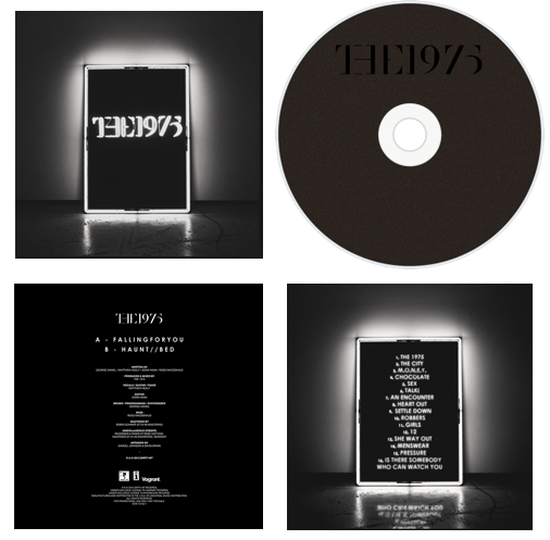
the use of an illuminating square around the cover of the digipak allows there to be a center and eye catching part of the cover. this square design is effective because it is used on many of their designs and products. the all black cover is effective because it is helping to represent the bands simple image and style that they portray.
the inside of the digipak folds out and shows the same black with white light style this is effective because this is allowing the product to have a consistent style.. the use of black and white has been used through out this is a very effective feature as it allows the white to stand out on the black background.
this design includes all of the normal conventions of a digipak it has the name of the band, a track list and the links and logos to social media sites that they are on. it also includes the logo of the record label this means they they are able to show who they are signed to.
although black tends to be associated with goth and metal music it has been used effectively within this digipak because it has been used to display their classic style with a modern twist this has been shown through the use of lighting and the style that has been used on the CD design its self. this creates an effective design as it helps to represent the band in the style they they are and the genre that they produce. the use of color schemes has allowed the band to portray themselves in a specific genre.
Friday 5 February 2016
Representations - Rihanna Loud
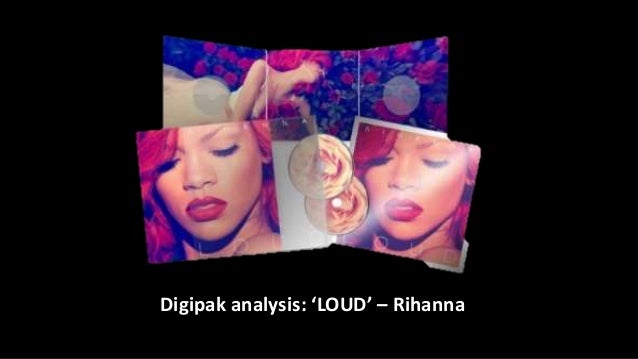
Ther use of constant bold eye-catching colours such as red and pink have allowed Rihanna to create a bold digipak that stands out from others like it. the use of red hair and red lips on the cover have allowed her to portray her self in a sexual way. the use of her looking away from the camera suggest shyness and this is helping to emphasise the look that she is trying to achieve.
the inside cover and the CD match the use of red roses and a floral theme have been used to create a feminine style. the use of red roses has allowed Rihanna to portray a love and passion style through her digipak and album. on the cover there has been a close up shot of her face used this is effective because the use of bold imagery is what is sued to help sell the album and a photo of her is what does this.
on the back cover along with the track list images of her have been used there are no close ups of her face or expression but mid shots have been used to show her body and outfits these have been done in a provocative way. this is effective because this is one of the main features that appeals to the viewer and the buyers. this helps to create a more powerful selling point for the product.
the use of an insert that is telling the viewer about what Rihanna thinks of her music and what the songs mean allows the viewers to feel like they have a connection with her. this is used to allow the viewer to understand what Rihanna's music means to her and how she interoperates it her self once she has produced it.
Representations - Lana Del Ray

Front Cover
This cover has bold representations within it. she is wearing a white shirt that is buttoned up to the top this is suggestive of purity, innocence and that she is conservative. the use of light colours and bold contrasts allow the style of innocence to be emphasised like she is not hiding anything.
The use of a mid shot is sued to allow the viewers to see her from the waist up. this is effective because this allows the viewer to make a connection with her and also allow them to see what she is wearing which can allow the viewers to relate to her.
the use of basic makeup and bold red lipstick is effective because it is allowing there to be a focus point that makes to viewer look towards her lips. the use of red lipstick has created the look of energy and sex appeal which will reach out to more viewers.
a blank vacant look is used on her face to suggest that she is distant form everything and she is not focused on anything. this is also used to suggest a more mysterious person who is potentially hiding something. this is effective on he viewer as they become enticed by this.
CD and Text
the use of red roses on the CD its self portrays passion , love and courage to the viewers. this is important because this allows the red style throughout her digipak to have a theme of red and white. these contrasting colours and meanings have allowed her to achieve an effect that makes her seem alternative and mischievous. this is effective because this bold contrast will allow the audience to view the style as they want to.
Moodboard and brainstorm of ideas
I have used a basic style of digipak as my chosen inspiration. I think that this is the best option as it will be one of the simpler styles that I will be able to make. The best style that I can use is the Kodaline digipak and covers this is because they have a similar synergy to the style that is in my music video.
in Disclosures album Caracal they have used a clear sleeve on their digipak. I like the idea of doing a four side digipak with a clear sleeve I think that this will be the most effective. this will allow me to create a digipak that will be basic with no text on it but the title and other features will be written on the clear sleeve and the track list will be on the back of the digipak.
However if I use a six side digipak like Lana Del Rey's (top right) this will be effective as I can include more images and more detail about the artist. this means that I will be able to include extra features such as inserts like lyric books and band member profiles.
The use of a main colour scheme like The 1975's and Arctic Monkeys will allow the effect of the design to flow and be more impacting to the viewer as this will enhance the white features that are on the design. if I was going to do a basic design that was only text I would use inspiration from Lorde's new album Pure Heroine because this design would allow me to have bold text that is the main feature on the design which links to the style that she is portraying through her music and her style.
On Mumford and sons and George Ezra's albums they have used an image of the band or artist on the cover. I think that I will not do this as it may make the style to begin to seem cluttered. I believe that by including minimal photos of people in the digipak this will allow the style to be different and stand out from other digipak that have been made.
Subscribe to:
Posts (Atom)
